
We all know by now that most visitors only scan webpages. In fact, most do not read more than 20% of the textual copy on a webpage. Sad but true, so don’t go wasting too much precious time and energy writing essays when a concise, clever piece of copy will do. Be amenable, and give your visitors what they want.
There are several common design layouts suggested for placement of text, and I’d like to explore the F-pattern in this article.
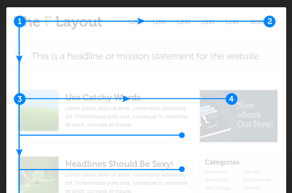
Image Credit
Jacob Nielsen’s research F-Shaped patterns for reading web content suggests that readers scan in an F-shape. It works something like this:
- Visitors start reading in the top lefthand corner and read horizontally to the top righthand corner, forming the first bar of the F-shape.
- Next, they scan down the page on the lefthand side and read in a second horizontal section, forming the second shorter bar of the F-shape.
- Finally, they scan the last bit of the content in a vertical movement, creating the stem of the F-shape.
The F-pattern is a guide of course, and heat maps sometimes show what looks more like an E-shape. This depends on the type of content on the website i.e. text heavy content, and also what other design elements are present. Relevant, interesting copy can also influence how far down the page the visitor will read.
What this means for writing copy?
- The headline should be as near to the top of the page as possible in order to communicate the site’s purpose immediately.
- The sub-headers or sub-content come next preferably starting on the lefthand side and broken down into bite size chunks that they can scan. Use bullets or sections and cover only one idea per paragraph.
Why it works?
Because the F-pattern allows readers to scan naturally. It mimics their natural sight patterns.
The F-pattern is by no means perfect and can be monotonous. Repetitive content patterns can be boring and can actually influence conversion negatively. To avoid this, you can throw in a variable row of content every now and then or an image or advert to distract from the repetition.
Summary
The F-pattern as with the other common design layouts, is a good starting point for webpages using large blocks of text. It’s good to use as a way to draw the reader into the content but shouldn’t be adhered to as a hard and fast rule. Don’t feel forced to cram your content into the pattern but rather make sure your content (visual and copy) is relevant and interesting. If your reader feels engaged they will continue reading.